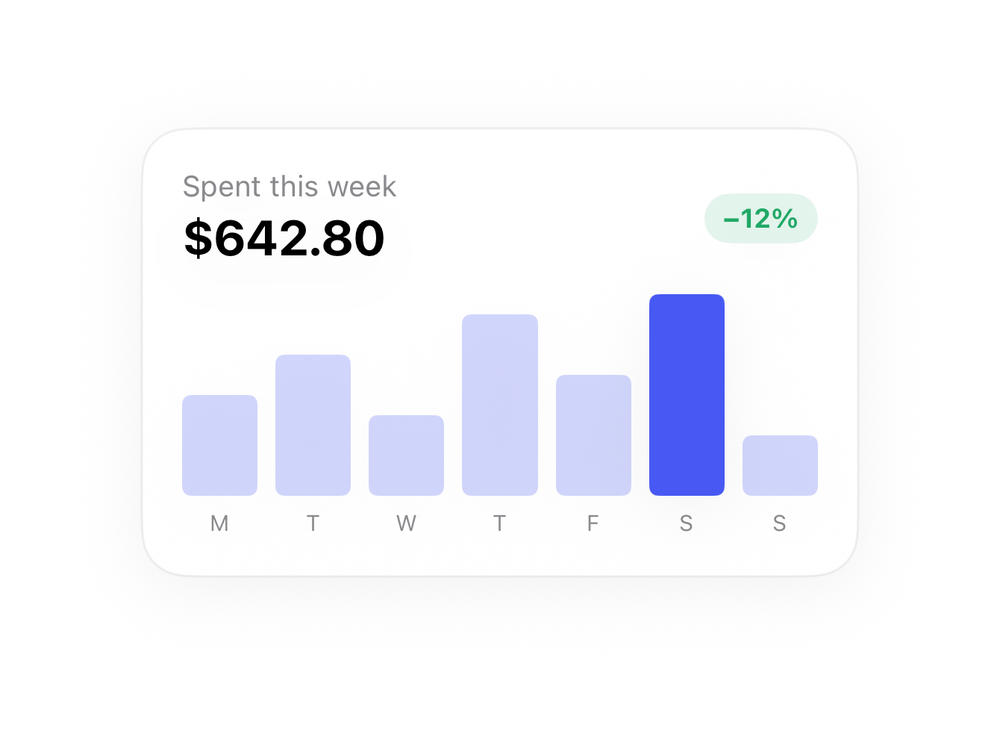
Spending Chart
NFrom Nibware - Original components, crafted in-house.
A weekly spending bar chart.
Finance · 31 lines · SwiftUI · iOS 17+
The actual source
SpendingChart.swift
import SwiftUI

let fnGreen = Color(red: 0.13, green: 0.66, blue: 0.40)

let fnBlue = Color(red: 0.28, green: 0.35, blue: 0.95)

extension View {
    func fnCard(_ w: CGFloat, _ pad: CGFloat = 18) -> some View {
        self.padding(pad).frame(width: w)
            .background(Color(.systemBackground), in: RoundedRectangle(cornerRadius: 20, style: .continuous))
            .overlay(RoundedRectangle(cornerRadius: 20, style: .continuous).stroke(Color.primary.opacity(0.06), lineWidth: 1))
.shadow(color: .black.opacity(0.05), radius: 14, x: 0, y: 6)What it needs
Self-contained SwiftUI - system materials, SF Symbols, no external dependencies. Everything it needs - tokens, sub-views, models - is carried in the copy-paste source above.