Billing Option Cards
NFrom Nibware - Original components, crafted in-house.
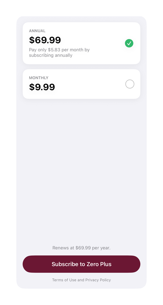
Elevated annual/monthly billing cards with a selected checkmark.
Pricing · 33 lines · SwiftUI · iOS 17+
The actual source
BillingOptionCards.swift
import SwiftUI

func prButton(_ label: String, bg: Color, fg: Color = .white, radius: CGFloat = 12, size: CGFloat = 16) -> some View {
    Text(label).font(.system(size: size, weight: .semibold)).foregroundStyle(fg).frame(maxWidth: .infinity).padding(.vertical, 15).background(bg, in: RoundedRectangle(cornerRadius: radius, style: .continuous))
}

/// Zero - "More Billing Options": two elevated cards (annual selected with green check).
struct PricingZero: View {
    let maroon = Color(red: 0.42, green: 0.09, blue: 0.20)
    let green = Color(red: 0.20, green: 0.72, blue: 0.42)
    func card(_ tag: String, _ price: String, _ sub: String?, _ sel: Bool) -> some View {
HStack {What it needs
Self-contained SwiftUI - system materials, SF Symbols, no external dependencies. Everything it needs - tokens, sub-views, models - is carried in the copy-paste source above.