Story Rings
NFrom Nibware - Original components, crafted in-house.
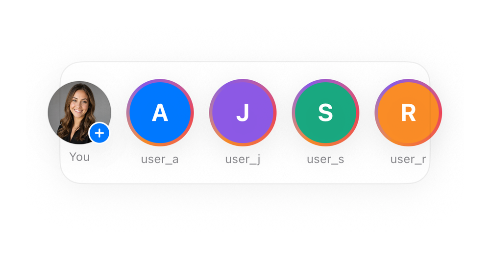
A story rings row.
Social · 41 lines · SwiftUI · iOS 17+
The actual source
StoryRings.swift
import SwiftUI

let soBlue = Color(red: 0.0, green: 0.47, blue: 1.0)

let soRed = Color(red: 0.94, green: 0.27, blue: 0.35)

extension View {
    func soCard(_ w: CGFloat, _ pad: CGFloat = 16) -> some View {
        self.padding(pad).frame(width: w)
            .background(Color(.systemBackground), in: RoundedRectangle(cornerRadius: 20, style: .continuous))
            .overlay(RoundedRectangle(cornerRadius: 20, style: .continuous).stroke(Color.primary.opacity(0.06), lineWidth: 1))
.shadow(color: .black.opacity(0.05), radius: 14, x: 0, y: 6)Images this component uses
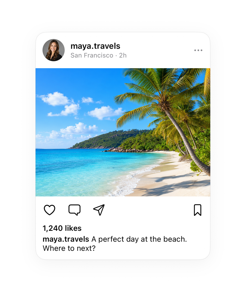
The code references this image by name. Download and drag into your Xcode Asset Catalog, keeping the same name, and the component renders exactly like the preview. Or swap in your own.

What it needs
Self-contained SwiftUI - system materials, SF Symbols, no external dependencies. Everything it needs - tokens, sub-views, models - is carried in the copy-paste source above.